Users decide whether to trust a product within seconds — often before reading a word of copy. That first impression is formed almost entirely by design: how consistent it feels, how much it respects their time, and how honestly it communicates. Here are the patterns that build (or quietly destroy) that trust.
- Trust is built by consistency, clarity, honest information and graceful error handling.
- Generic trust badges matter less than real, specific details about your business.
- Slow or broken pages damage credibility as much as poor copy.
- Audit your key pages against a short trust checklist.
Consistency signals competence
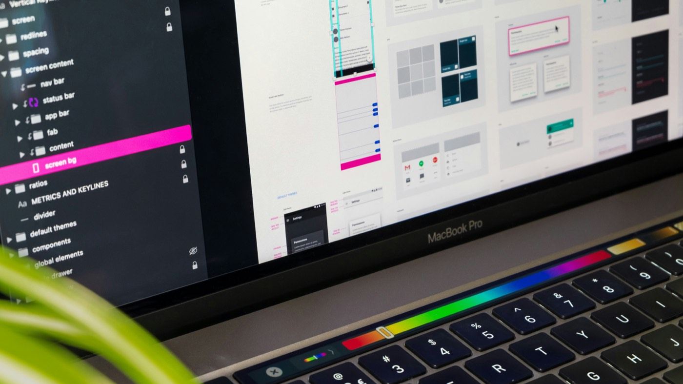
A consistent design system — spacing, color, typography, component behavior that doesn't change unpredictably from page to page — is one of the cheapest trust signals you can build, and one of the most commonly skipped under deadline pressure. When buttons look and behave the same way everywhere, when the same action always produces the same result, users build an accurate mental model of your product quickly. Inconsistency, even small and purely visual, reads subconsciously as "this wasn't cared for," and that impression transfers to how much a user trusts the business behind it.
Clarity over cleverness
Clever microcopy and novel interaction patterns can be delightful, but only once basic clarity is established. A button that says "Continue" beats one that says "Let's go!" if there's any ambiguity about what happens next. Novel UI patterns — swipe-to-reveal actions, icon-only navigation without labels — ask users to learn something new at the exact moment they're deciding whether to trust you. Save the cleverness for moments where the stakes of misunderstanding are low.
Show your work
Loading states, progress indicators, and confirmation messages all communicate the same underlying thing: "we know what's happening, and so do you." A checkout that goes silent for three seconds after a click reads as broken, even if it's actually processing correctly. A visible spinner, a "Processing your payment…" message, or a progress bar all cost little to build and remove a significant amount of anxiety at moments — payment, submission, account creation — where anxiety is highest.
- Immediate visual feedback on every clickable action, even a simple hover or press state
- Explicit loading indicators for anything that takes longer than roughly 300ms
- Clear confirmation after every meaningful action — form submitted, order placed, changes saved
"Trust isn't a badge you add at the end — it's dozens of small, consistent decisions."
Real information, not stock trust badges
Generic padlock icons and unverifiable "as seen in" logos have become so common that users largely tune them out. What still works: real customer photos and named testimonials, specific numbers instead of vague claims ("2,400+ orders shipped" instead of "trusted by thousands"), and transparent policies written in plain language instead of legal boilerplate. Specificity reads as honesty; vague reassurance reads as marketing.
Handle errors like you mean it
How a product behaves when something goes wrong tells users more about whether to trust it than how it behaves when everything works. A form that clearly explains what went wrong and how to fix it builds more trust than one that never has an error at all, because it demonstrates the product was actually designed for the messy, real way people use it — not just the happy path.
Quick Self-Check
Look at your last five user-facing error messages. If any of them are generic ("Something went wrong") or purely technical (a raw error code), that's a trust gap worth fixing.
A trust checklist for your key pages
- A clear statement of what you do and who it is for, above the fold.
- Real contact details: address, phone number and email that work.
- Named people, real photos and a genuine "about" story.
- Specific examples of your work, with permission from clients.
- Clear policies for privacy, refunds and delivery, easy to find.
- Consistent branding, spelling and design across every page.
Trust on checkout and forms
Forms and checkout are where visitors decide whether to hand over personal or payment details. Keep them short, explain why you need each piece of information, show the total cost early, use a recognisable payment provider and make sure the page is fast and error messages are helpful.
Small details that add up
- Working links and images, and no broken layouts on mobile.
- Secure HTTPS across the whole site.
- Fast load times, since slow pages feel untrustworthy.
- Plain language instead of jargon and inflated claims.
Frequently asked questions
What builds trust on a business website?
Clarity about what you offer, real contact details, named people, specific examples of your work, clear policies and a fast, professional, error-free experience.
Do trust badges actually work?
Generic badges add little on their own. Specific, verifiable details such as real client work, clear policies and recognised payment providers are more convincing.
How important is page speed for trust?
Very. Slow or unstable pages make a business feel unreliable, and they also hurt conversions and search visibility.
How can I show credibility without reviews yet?
Show real work, explain your process, introduce your team, publish useful content and make it easy to contact you. Add reviews and testimonials as you earn them.
Trust is a design decision, not an afterthought
We build these patterns into the design system from day one on every project — not as a polish pass at the end, but as part of the same decisions that shape layout and navigation. Trust compounds the same way friction does: in dozens of small, consistent choices a user never consciously notices, but absolutely feels.